
Some brands are instantly recognizable the moment you see their colors, logo, or typography, while others fade from memory just as quickly. That contrast raises an important question: what is the primary goal of branding in graphic design? To answer, keep reading to see how design turns a ‘meh’ brand into a ‘must-have’ experience.
Key Takeaways
Before jumping into what is the primary goal of branding in graphic design, it is important to understand that branding is the strategic process of shaping perception. While marketing aims to sell, branding aims to define by creating an identity, a voice, and a sense of emotional meaning.
This process operates on a psychological level, influencing how an audience feels before they ever engage with a product. These subconscious impressions, whether of luxury, trust, or innovation, form in an instant. Strong branding ensures that these gut feelings match the company’s intended reality.
Ultimately, graphic design is making every strategy visible. By translating brand values into a coherent system of color, type, and imagery, it sends an immediate signal of professionalism.
To truly understand the primary goal of branding in graphic design, we must look at its deeper strategic intent. This foundation is built upon the 4 pillars of branding in graphic design, which guide every visual decision a designer makes. Here are the details!
In saturated markets, visual similarity makes brands interchangeable. Strong branding builds uniqueness through distinctive typography, proprietary colors, and consistent visual language. Clear differentiation reduces confusion. When done well, audiences recognize a brand instantly without reading its name.
Studies found that design typically shapes first impressions within 5 seconds. Clean layouts, professional typography, and consistency signal credibility and reliability. Meanwhile, poor or inconsistent design creates doubt, even when product quality is high.
Recognition builds familiarity, and familiarity drives preference. Consistent visual elements strengthen memory associations over time. Colors, shapes, and typography become brand triggers. Stable visual systems across platforms improve recall and long-term recognition.
Beyond logic, people connect with brands that reflect their values and identity. Strategic branding evokes feelings such as confidence, excitement, nostalgia, or aspiration. When audiences emotionally attach to a brand, they move from customers to advocates. This is where branding shifts from transactional to relational.
To achieve the purpose of branding in graphic design, designers rely on foundational systems as follows.
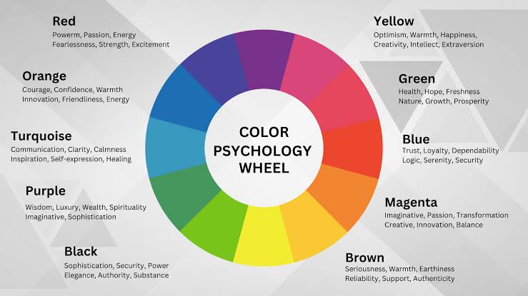
Colors shape perception subconsciously. For example, blue signals trust, red energy, black sophistication. Strategic color choices reflect brand positioning and audience expectations. Consistency across platforms strengthens recognition. Even slight shade changes can weaken identity without clear guidelines.
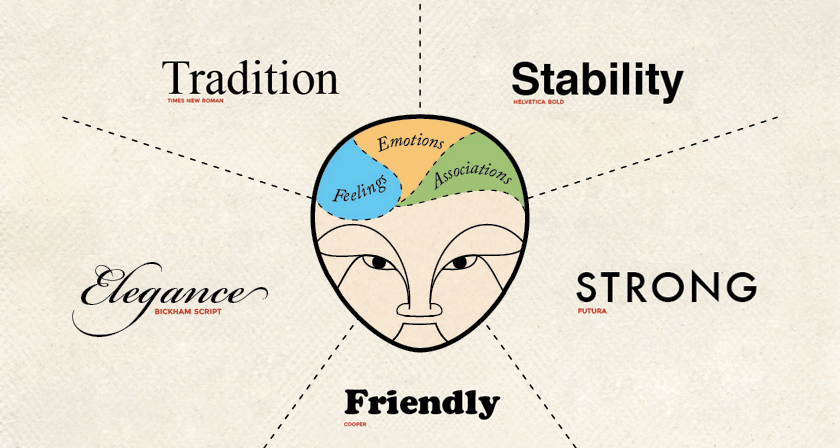
Typography defines brand tone. For instance, serif feels traditional, sans-serif modern, script elegant or creative. Font choice shapes how messages are perceived, and consistent typography across platforms builds cohesion. This strong system boosts professionalism and memorability.
Logos act as compact brand signatures. Effective logos are simple, scalable, and adaptable for digital and print use. This is a sign that simplicity improves recognition and recall.

Layout guides how information is processed. Clear hierarchy directs attention and improves readability. Spacing, alignment, and contrast enhance user experience. With strong structure, professionalism and communication clarity can be achieved.
To better understand graphic design branding examples, consider the following brands that consistently demonstrate strong differentiation, trust, and memorability.

Apple’s minimalist design language reflects innovation and premium quality. Its consistent typography and product aesthetics reinforce a clean, sophisticated identity.

Nike uses bold visuals and dynamic layouts to communicate energy and movement. The iconic Swoosh ensures immediate recognition.
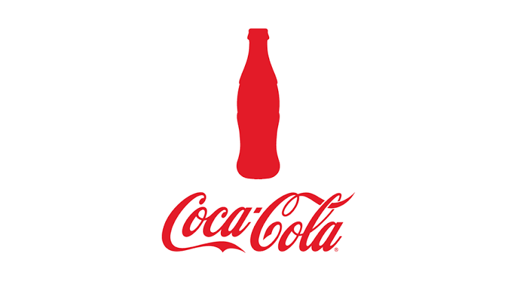
Coca-Cola’s timeless script typography and consistent red color palette create multi-generational brand recall.
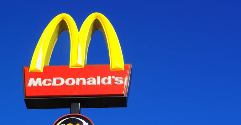
The Golden Arches and red-yellow system provide universal consistency and instant identification worldwide.

Google maintains a clean, accessible identity with adaptable yet consistent design principles across platforms.
In the end, understanding what is the primary goal of branding in graphic design means realizing that branding is about shaping perception, not just visuals. The true objective is to build a clear, consistent identity that audiences can instantly recognize and trust.
Typography is one of many factors that plays a strategic role in delivering that identity across every touchpoint. When chosen carefully, a typeface becomes the voice and personality of the brand itself.
To support that goal, brand identity fonts from SIXTYPE can help designers craft cohesive and scalable visual systems. High-quality fonts with refined kerning, multiple weights, and multilingual support ensure consistency across print and digital media. This precision strengthens brand positioning and maintains visual harmony.