The best logos of all time often become memorable long before people read a company’s slogan or visit its website. Customers form an impression simply by seeing the symbol. Research about consumer perception shows that the human brain processes visuals much faster than text, which is why recognizable logos like Apple or Nike can be identified instantly even without words.
Besides building trust, a good logo also makes a company easier to remember over time. Therefore, this article explores what makes a logo effective and explains why some logos remain strong and recognizable for many years.
Key Takeaways:
From global giants to design legends, these 15 logos show how simplicity, creativity, and memorability create lasting impact.
As one of the most popular logo designs, the Nike Swoosh shows how a simple symbol can build a powerful brand identity. The curved shape symbolizes motion, speed, and athletic performance, aligning perfectly with the brand’s image.
The Apple logo is one of the most famous tech logos worldwide. It shows how a simple design can create a strong brand image. The bitten apple represents creativity and modern technology, while its monochrome style allows it to adapt seamlessly across products, advertisements, and digital platforms.
Who doesn’t know McDonald’s? This fast-food restaurant is known for its simple logo. The “M” shape has a strong visual identity and is easy to recognize even from a distance, making it one of the best logos of all time.
In addition to its shape, the bright yellow color creates a warm and friendly feeling that appeals to families and children as their target market.
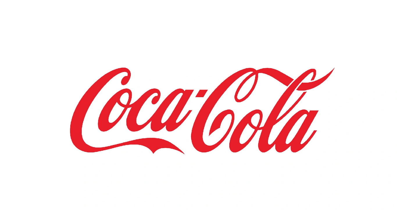
The Coca-Cola logo shows the power of typography in branding. The cursive lettering gives the brand a warm, familiar feeling, while the red color attracts attention and energy. Its long-term consistency allows people around the world to recognize it instantly.
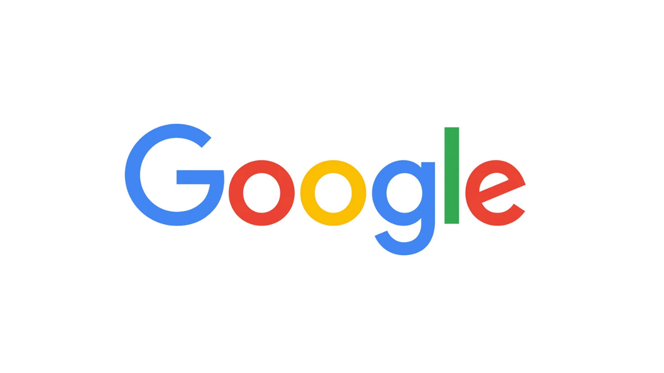
People often use Google in their daily lives. The logo is simple, combining clean lettering with bright primary colors. As a result, it gives a playful and welcoming impression to users. Moreover, the clean sans-serif typography also makes it easy to read on screens of any size, from mobile phones to desktop monitors.
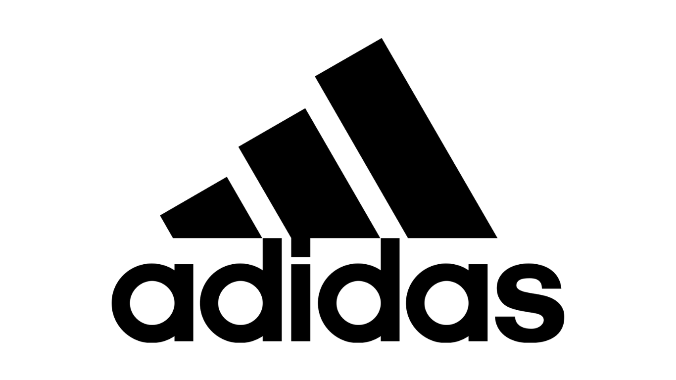
Adidas is often included among the best logos of all time because of its simple yet meaningful design. Its three-stripe logo symbolizes performance and progress, reflecting the brand’s focus on sport and achievement.
Has Adidas successfully built its identity? The answer is yes. Through consistent use over the years, the Adidas logo has developed strong recognition among consumers worldwide.
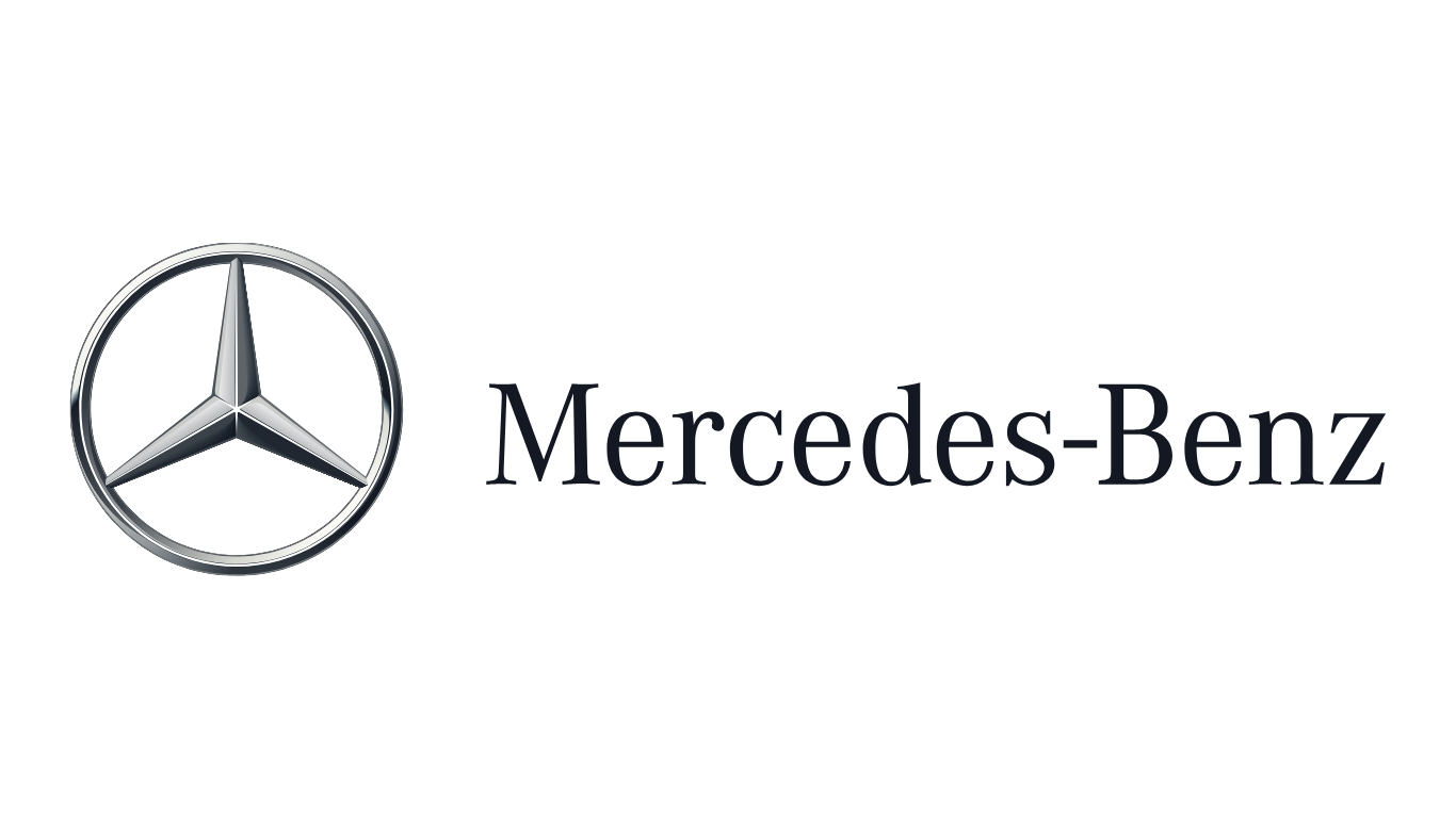
As a symbol of luxury, the Mercedes-Benz logo uses a simple three-pointed star to express innovation and precision. The minimal design looks elegant on vehicles and promotional materials. With consistent use for decades, the logo has become a strong identity that reflects reliability and prestige.
Starbucks builds its identity through a detailed yet balanced symbol. Featuring a twin-tailed siren inside a green circle, the logo creates a unique and memorable image. The green color conveys freshness and comfort, reflecting the relaxing experience customers enjoy at the café.
Even after several design updates, the core symbol has remained consistent, allowing people to recognize the brand instantly, even without the name.
FedEx demonstrates how a simple design can be highly effective. Often listed among the best logos of all time, the logo cleverly uses the negative space between the “E” and “x” to form an arrow, communicates forward movement and efficiency, key traits of the delivery service.
In addition, its straightforward typography and subtle creativity make the brand easy to read and instantly recognizable on any medium.
As a marketplace platform, Amazon has created a clever logo that reflects its strong brand identity and clear message. The arrow connecting “A” to “Z” represents the wide range of products available, while its curved shape also forms a smile, conveying friendliness and customer satisfaction.
Thanks to its bold and dynamic design, Pepsi has one of the best drink logos recognized by people around the world. Its circular shape, combined with red, white, and blue colors, creates a sense of energy, fun, and refreshment.
The logo’s clean design and consistent use across packaging and advertising make the brand instantly recognizable globally.
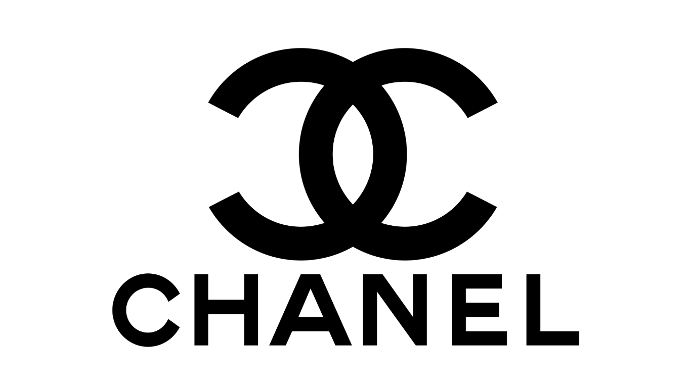
Chanel features one of the best logos of all time, thanks to its clean and elegant design. The interlocking double “C”s symbolize the founder’s initials and reflect the brand’s enduring values of sophistication and timelessness.
Its minimal black-and-white design exudes luxury, making the logo instantly recognizable on fashion items, perfumes, and accessories, and allowing it to stand out even among other famous brands.
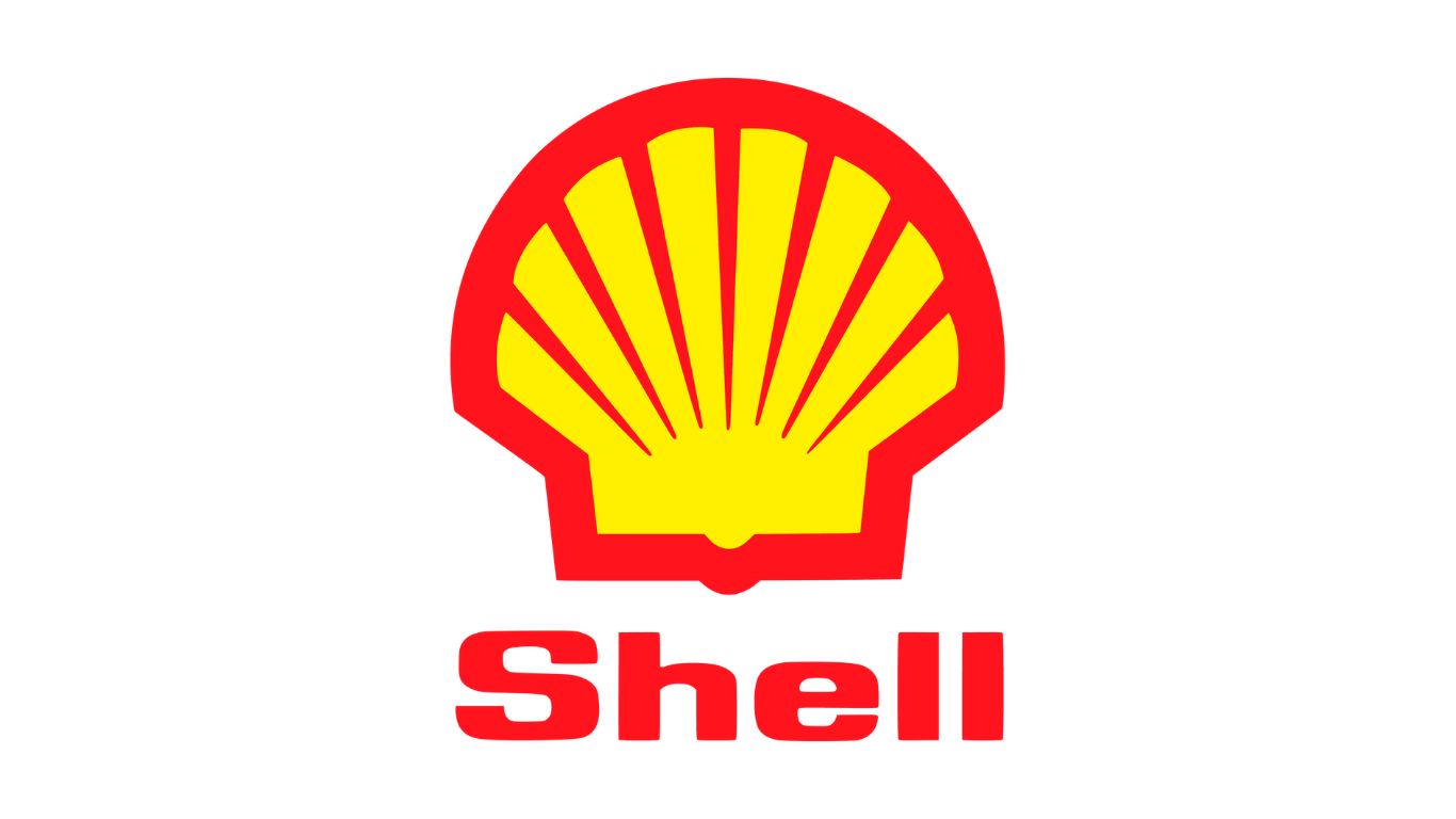
The company uses a shell emblem to reflect its values of energy, warmth, and reliability. Combined with bright yellow and red colors, the design effectively represents the products and services they offer and is easy to recognize across gas stations and promotional materials. This timeless design has helped Shell remain a trusted and iconic brand for decades.
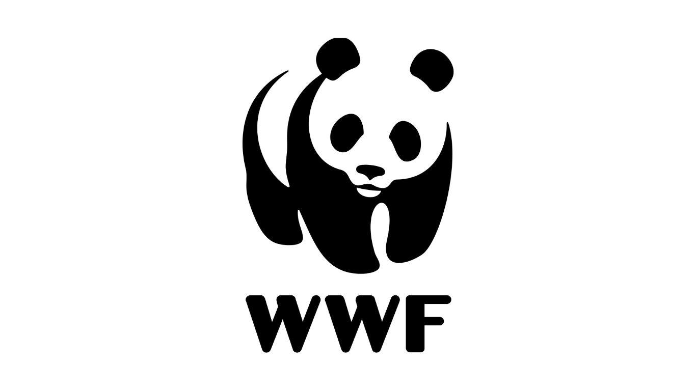
The WWF logo tells a story with just a single image. The black-and-white panda symbolizes hope and protection for wildlife worldwide. Simple yet striking, the design is easy to recognize and carries the organization’s mission everywhere from fundraising events to awareness campaigns, making it a timeless symbol of conservation.
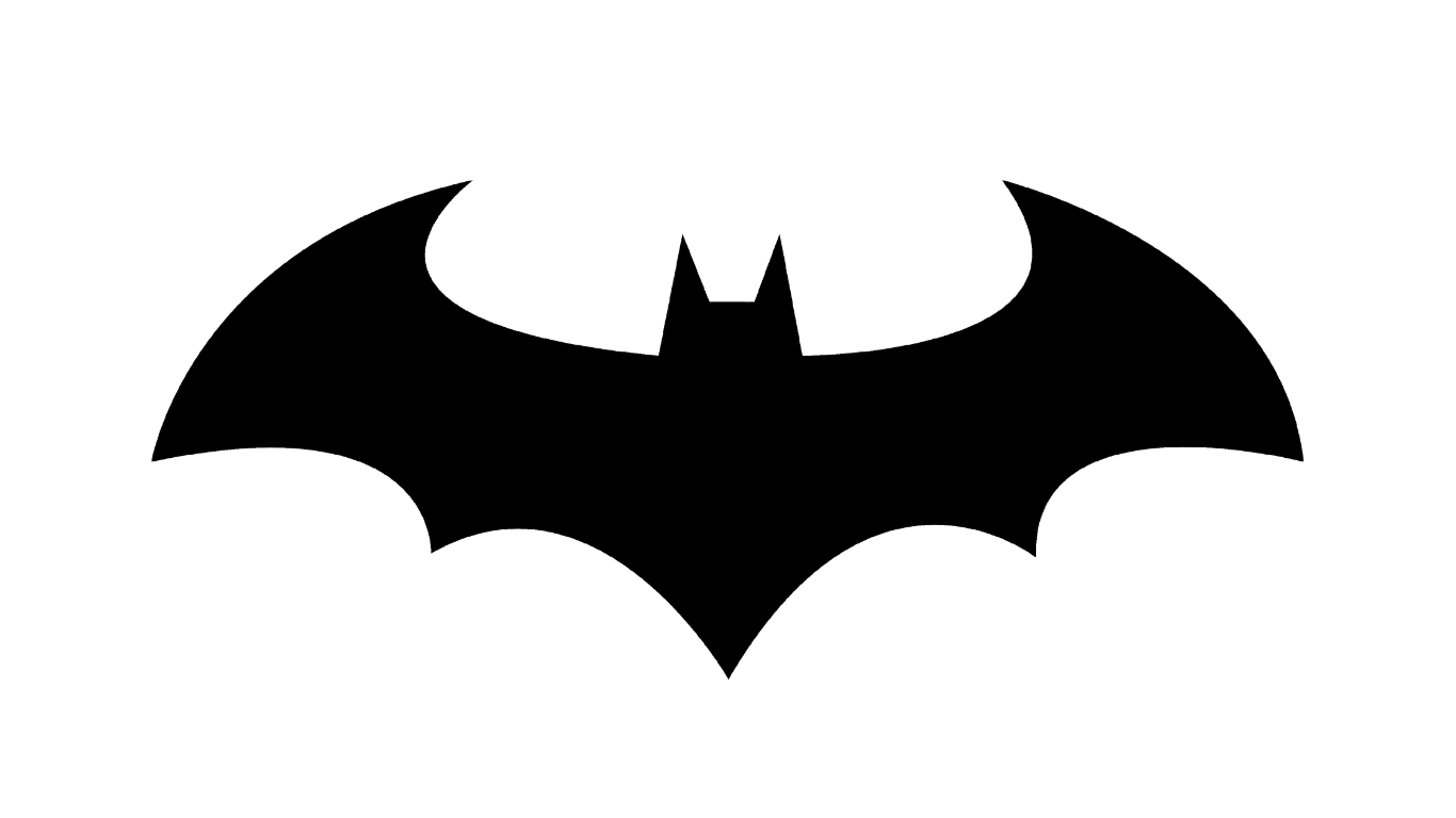
The Batman logo represents heroism and justice. Its simple black bat against a yellow oval conveys mystery, power, and courage, perfectly reflecting the character.
Over the years, the symbol has appeared in comics, movies, and merchandise, remaining instantly recognizable. Its bold, timeless design captures the essence of Batman and continues to inspire fans everywhere.
After exploring the best logos of all time above, you may notice that they share a few key qualities: simplicity, consistency, and versatility. These elements make brands easier to recognize, communicate a clear message, and remain memorable across platforms and generations.
If you want to create a timeless logo, keep these principles in mind and focus on visual elements that truly represent your brand. Experiment with different components, such as symbols, colors, and typography, to find the best match for your identity.
If you ever need a distinctive font for your branding, you can rely on SIXTYPE. By leveraging Brand-ready fonts, you can ensure your brand remains legible, stands out, and leaves a lasting impression.